Send us a Message


Submit Data |  Help |  Video Tutorials |  News |  Publications |  Download |  REST API |  Citing RGD |  Contact   

PhenoMiner Help

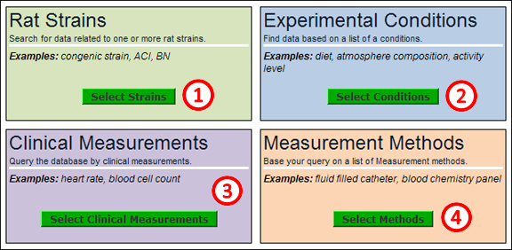
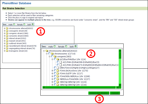
The purpose of the PhenoMiner tool is to integrate phenotypic data collected from different rat strains under differing experimental conditions using a variety of measurement methods.  Users build queries to find the desired information by selecting subsets from each category of data.

How do you get to PhenoMiner?

On the RGD home page click on the Phenotypes & Models tab (1) at the top of the page.
On the Phenotypes & Models page, click on the “Phenominer Database” on the menu bar (1) or on the “Go to PhenoMiner” link in the middle of the page (2).

PhenoMiner Tool

The PhenoMiner home page displays a choice of four different categories to begin the data selection process.  The data results are successively filtered by the choices made in these four parameters.
1. Rat Strains
Clicking the “Select Strains” button opens a search page with a browser used to pick one or more rat strains.

2. Experimental Conditions
Clicking the “Select Conditions” button opens a search page used to pick one or more experimental conditions, such as diet, atmosphere composition, or activity level.

3. Clinical Meaurements
Clicking the “Select Clinical Meaurements” button opens a search page used to pick one or more clinical measurements, such as heart rate or blood cell count.

4. Measurement Methods
Clicking the “Select Methods” button opens a search page used to pick one or more measurement methods, such as fluid filled catheter, blood chemistry panel, or radiotelemetry.

Rat Strain selection browser
Rat Strains are organized according to the RGD Rat Strain Ontology.  To search for one or more strains, first click on the + icon to left of any folder (1).  Continue searching through folders by clicking + icons until the desired strain or strains is found.  To make a selection(s) click the checkbox(s) to the left of any folder(s) or specific strain symbol(s) (2).  To proceed through the tool, click the “Select Rat Strains” button under the selection frame (3).

The search pages for the other three parameter options look the same as the rat strain search page.  The only difference is the ontology from which the terms are taken: Clinical Measurements are organized according to the RGD Clinical Measurement Ontology, Experimental Conditions are organized according to the RGD Experimental Conditions Ontology, and Measurement Methods are organized according to the RGD Measurement Methods Ontology.

Intermediate selection page
This intermediate results page is returned after clicking the “Select Rat Strains” button.  All the selected rat strains are listed (1) with number of data records for each strain shown in parentheses. A record tally is shown below the strain list and in the upper right side of the page (2).  The three remaining categories from the PhenoMiner home page may still be selected using the “Limit by…” buttons in the middle of this page (3).  At this point or after selecting any or all of the remaining three limiting parameters, the “Generate Report” button may be clicked on the intermediate results page (4).
PhenoMiner Report Page
Upon clicking the “Generate Report” button on the intermediate selection page, a report page is returned.  In this example the data has been filtered by strain and clinical measurement.  The default graph can be altered by selecting/deselecting any of the options in the “Customize Chart” section (1) at the top of the page, followed by clicking the “Refresh Chart” button on the top left of the page.  Here, he default graph (2) has heart rate values on the Y axis and experiments labeled by strain symbol on the X axis. The data is also displayed in a table format underneath the graph (3). The data table has sortable columns, expandable rows, and the option of downloading data to a spreadsheet.  
Expanded Report Page
The graph on the report page has expandable functionality.  If any of the graph bars (1) that have white crosses in their center are clicked, a second graph (2) is displayed below the first one.  The second graph gives more specific information about the particular experiment represented by the bar in the first graph.  In this example the second graph shows number of animals on the Y axis and discrete ranges of heart rate on the X axis.


[Return to top of page]


NHLBI Logo

NHLBI Logo

RGD is funded by grant HL64541 from the National Heart, Lung, and Blood Institute on behalf of the NIH.