Send us a Message


Submit Data |  Help |  Video Tutorials |  News |  Publications |  Download |  REST API |  Citing RGD |  Contact   
Pathways

PhenoMiner Help Page

Introduction to RGD’s PhenoMiner:

PhenoMiner is a tool for ontology-based storage and mining of quantitative phenotype data for the laboratory rat. PhenoMiner includes both data from high-throughput phenotyping projects (standardized) and scientific literature (unstandardized).

  • To allow comparisons across studies as well as flexible and intelligent querying, PhenoMiner uses ontologies to express:

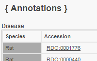
  • 1. What was measured (Clinical Measurement Ontology)

    2. How it was measured (Measurement Method Ontology)

    3. Under what conditions it was measured (Experimental Condition Ontology)

    4. In what animals it was measured (Rat Strain Ontology)

  • The Vertebrate Trait Ontology is also used to group related measurements within a study.

  • PhenoMiner can be accessed through the “Analysis & Visualization” tab in the menu at the top of any RGD page.

Jump to information about the:

PhenoMiner 2.0 Interface

PhenoMiner 2.0: More intuitive selection and modification

The PhenoMiner 2.0 results display consists of three parts

The PhenoMiner 2.0 graph is more interactive: “Colored by” function

Sorting the table reorders the bars in the graph


PhenoMiner 2.0 Interface

  • PhenoMiner 2.0 has all of the components are on a single page. The Strain Ontology loads automatically but you can still start with any of the ontologies by using the tabs in the lower right panel.

  • As selections are made in the bottom panels, they appear in the boxes at the top.

  • The bottom left panel includes a prominent search box and an alphabetical listing of the terms in the ontology that have associated PhenoMiner records.


  • Entering a term in the search box narrows the list below it.

  • “Select” puts the term into the box at the top and opens that region in the ontology tree in the bottom right panel making it easy to refine the selection, add terms, etc.

[Return to top of page]


PhenoMiner 2.0: More intuitive selection and modification

  • All selections are made within the same screen and all changes are shown in real time.

  • Switch back and forth between ontologies using the tabs in the bottom right panel.

  • Options are limited by previous selections. Click “Generate Report” to see the report from the options selected.

  • Remove terms using the check boxes in the lower panel or the in the top panel.

[Return to top of page]

The PhenoMiner 2.0 results display consists of three parts

  • The PhenoMiner 2.0 results display consists of three parts:

    • 1. A graph

    • 2. A list of filters

    • 3. A table of results

  • 3. A table of results

  • Note: If measurements that use more than one unit have been selected, the graph is hidden until the user filters the measurement selection.

  •  

    • The filters, graph and table are all interconnected.

    • Select filters on the left to limit what is shown in the graph and the table.

    • Start by searching for your strain in the search box or from the options in “Strains” on the lower boxes.

    • Remove filters by unchecking boxes on the left or by clicking for that filter at the top of the page.

    [Return to top of page]

    The PhenoMiner 2.0 graph is more interactive: “Colored by” function

    • Above the graph there is a dropdown where you can select what parameter you want the tool to use to color the bars in the graph.

    Data from the query can be downloaded

    • A button for “Download all records” is displayed on the pages for both unfiltered and filtered queries.

    • Filtered queries also have an option to download just the table view records.

    • Here the bars are colored by the phenotype/measurement. “Legend” is a dropdown that details what, in this case measurement, each color corresponds to.

    [Return to top of page]

    The PhenoMiner 2.0 graph is more interactive:Sorting the table reorders the bars in the graph

    • The table can be sorted by the values in any of the columns, as indicated by the up and down arrows in the column headers. Sorting the table reorders the bars in the graph accordingly. Here the graph is sorted by value in addition to coloring the bars by phenotype.

    [Return to top of page]

    • Where data for individual rats has been submitted, the graph shows the average plus the individual values.

    • Looking at the graph for mean arterial blood pressure, you can see that some of the bars include red dots indicating the values for individual animals.

    • Mouse over the bar to see a popup with details about the average value for that sample of rats under those conditions.

    • Mouse over a dot to see the details for that individual rat measurement.

    [Return to top of page]


    NHLBI Logo

    NHLBI Logo

    RGD is funded by grant HL64541 from the National Heart, Lung, and Blood Institute on behalf of the NIH.